Library and Archives Canada are full of good stuff isn't it. While scrolling again Canadian National locomotives I found out something disturbing. I didn't read a lot of books about Canadian railways in my life, but I'm still surprised to find stuff that should be more mainstream.
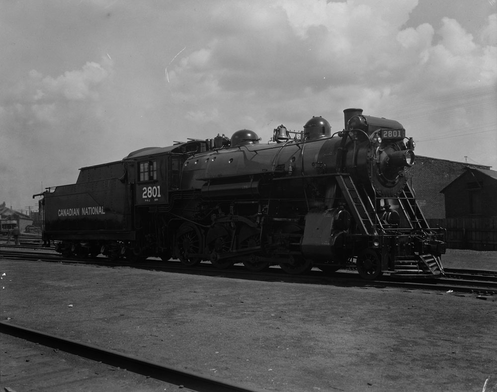
A series of photos taken in 1926 should freshly painted locomotives posing for posterity. At first, they look plain with their spartan à la CNoR lettering, but when you start to look in detail you find out the boiler jacket is sometimes painted in gray on passenger locomotives (at least from 1936 until WW2). I suspect the 2800 series (freight) is all black but the difference in lighting and finish (smoke box) induces a visual hallucination (I'd love to believe it's gray, but there's several shots of both locomotives taken the same day from different angles). Look for yourself, and if I'm wrong... well, let it be!
CNR 2801 (1926)
CNR 3198 (1926)
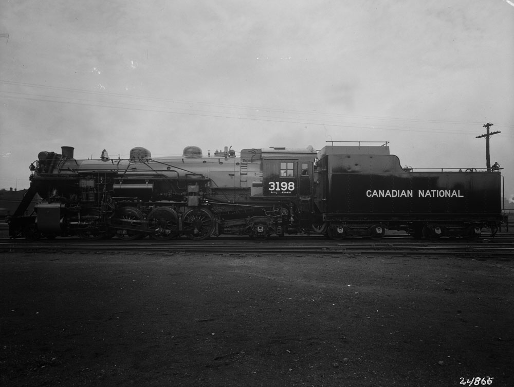
This is a case of a black boiler:
CNR 2800 (1926)
Move to 1936 and the streamlined 4-8-4 are also sporting the grey boiler. Fortunately, that fact is well known and a few brass models are indeed painted in that original scheme. The 5700 series also originally had a grey boiler and firebox.
CNR 6400 (1936)
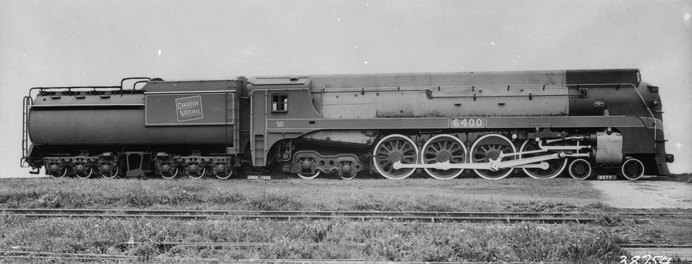
Once again, maybe I'm just a poor uneducated soul, but I find it quite disturbing to rarely see this paint schem. Particularly the passenger one with gray boiler. I'm curious to learn when the practice started (back in 1936 or before?).
It has often been said that CNR, strapped by cash and the war, took the easy way out and reused CNoR paint scheme as an expedient in its formative years.
Looking at these pictures show us this postulate, while true to some extent, is in fact biased. It has been argued Canadian National strong corporate identity only formed after the introduction of the tilted wafer, maple leaf and green color. I agree it was the first time CNR developped its own image and design since it formation. But it is doing a dissservice to say the previous paint scheme was a make shift, hardly attractive and spartan while photographic evidence show extremely neat locomotives with bold and modern sans serif police in white, high gloss paint and, sometimes, gray/metallic boiler jackets.
In fact, Canadian National during the 1920s had a fashionable look that was similar to other first class railroads in North American. The sleak paint scheme - which I would described as an elegant merger of CNoR modern design, GTR attractive painting practices (high gloss) and CNR home-brewn distinctive details - was far to be pitied and fitted perfectly that era of after war opulence.
I've used to believe CPR was glamour and CNR pragmatic before the introduction of the green color. Books told me so and I never questioned what I was being told. Seeing the photographic evidence, I can no longer subscribe to such a partial and deformed vision of a past era.
I'm more and more convinced the mainstream Canadian modellers are forgetting a marvelous era that existed between 1900 and the Second World War. Our judgement has been clouded for too long, thinking is was an era of failure when it layed the foundation of our modern world.
I remember an architecture teacher with whom I made many historic reasearch telling me many things that happened in the 50s and 60s were in fact planned in the late 1920s and 1930s but were postponed by global conflicts. I feel the same when I see the original Canadian National paint scheme. Black, white, pure fonts and a slight touch of red on the front plate... Doesn't it sound like a description of the celebrated CN wet noodle concept?
If I had to build a CNR steam fleet, I would seriously give a thought about the 1920s...
No comments:
Post a Comment