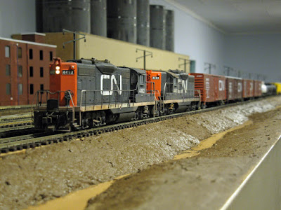
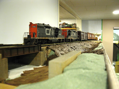
I'll be honest, I've never been a big fan of multi-deck layouts. I can understand how they maximize vertical space use, but they kill the impression of vast expanse of land. When I look at multi-deck layouts from the aisle, it's quite hard to appreciate the wonderful scenery that took years to plan and build. Everything end up sandwiched between two bulky layers of MDF. It makes the layout area nothing more than a residual space, not the main focus.
The ratio is about 1/3 scenery vs 2/3 fascia and the little actual layout we see is cropped. The only way to have a good sight is to look directly at a scene as if it was an aquarium. Many European small layouts use this framing method and it works well to hide the fact they are small by working as vignette. Not sure it does the trick when we are talking about basement-sized layouts. I only see lots of compromises for a very few advantages of longer mainline. The modeller also pointed out how working on the lower level is gonna be quite a tiresome task to not destroy the scenery.
 |
| Ominous skies over Ciment St-Laurent. |
His main concern is about the impact on photography and the unsightly superior deck underframe. Using software to rectify the photographs works well, but unfortunately, it doesn't work in real time when looking and operating the layout, which is the main concern. This modeller is well known for is realistic scenery and perfect mise en scène of rolling stock. I feel sad to see this double decking stuff is making him have to compromise in an area he excels. The new double deck will help him create new great scenes, but the cost is almost sacrificing what made the original ones great.
Many ways can be done to attenuate the problem. But it won't resolve it totally. I've got the same problem with our club layout: in one room, the ceiling is as low as 17" over the railhead and I get the same photography issue less the undeframe. Honestly, I quickly grew fed up erasing ceiling tiles after a while and I only do this for a few select images I want to pimp up a little bit.
 |
| Limitation of a low ceiling over Maizerets |
In the end, this modeller's photographs tell us something about the importance of sky. We tend to overlook that critical aspect too often. For us, it's just useless empty space, but in fact, I feel it truly defines a space and can modulate our perception of vastness. This is a key point in model railroading where selective compression and very limited horizontal space make us take a lot of shortcuts. If we are now cutting the sky, what is left than can carry the impression of distance? Once again, I think we go for the obvious and cherry pick what feels extraordinary. As if sky, which makes a huge portion of our visible horizon was mundane and not worth modelling to create a realistic space. Crop, crop, crop... now you're in a shoe box!
I'm quite curious to see how this resourceful modeller will work out this issue. I hope my critic won't offend him since it isn't my intent. I owe him a lot for encouraging me to pursue kitbashing and scratchbuilding. Two things who make my modelling efforts much more rewarding.
 |
| No sky limitation over Clermont. Makes the scene more realistic. |
Oh, next time you plan a scene, keep in mind the larger the scene you want to photograph, the higher the sky should be. The same applies for long perspective shots which are harder to photoshop later. After all, modelling sky is probably the easiest scenery work you'll ever do!
No comments:
Post a Comment